
Appearance
AdminSite Settings → Portal Settings
This page controls portal-wide preferences for what users see when they sign in — which navigation items appear, where contact form submissions are routed, the welcome content on the portal home page, and an optional site-wide footer.
Not to be confused with...
The Portals list under Settings → Portals is where you create and edit each portal's name, slug, and branding. Site Settings → Portal Settings (this page) configures the menus and homepage shown inside a portal.
Open Settings → Site Settings → Portal Settings.
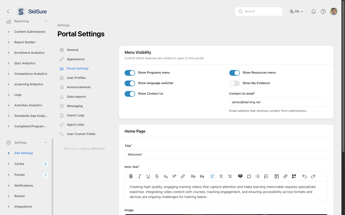 Portal Settings. Two sections: Menu Visibility (top) and Home Page (below).
Menu Visibility
Decide which sidebar items users see in this portal.
- Show Programs menu — hides the Programs nav entry when off.
- Show Resources menu — hides the Resources nav entry.
- Show language switcher — toggles the language selector in the top bar.
- Show My Evidence — controls the My Evidence nav entry.
- Show Contact Us — controls the Contact Us button.
- Contact Us email — the email address that receives contact-form submissions when Show Contact Us is enabled. Required when the toggle is on.
What arrives in that inbox
Each submission comes through as an email with the user's subject and message, and Reply-To set to the sender — so replying in your mail client goes straight back to them. Users can attach one file (PDF, Word, spreadsheet, CSV, text, PNG/JPEG/GIF, or ZIP, up to 10 MB), which arrives as an attachment on that email. Nothing is stored in SkilSure; if you need to keep an attachment, save it from your mail client. See Contact Us for what the user sees.
WARNING
Turning a menu off only hides it from the navigation. Direct URLs to those pages still work — use Roles and step-level access controls if you need to fully restrict access.
Home Page
The welcome card that appears beneath the quick actions on the user home page.
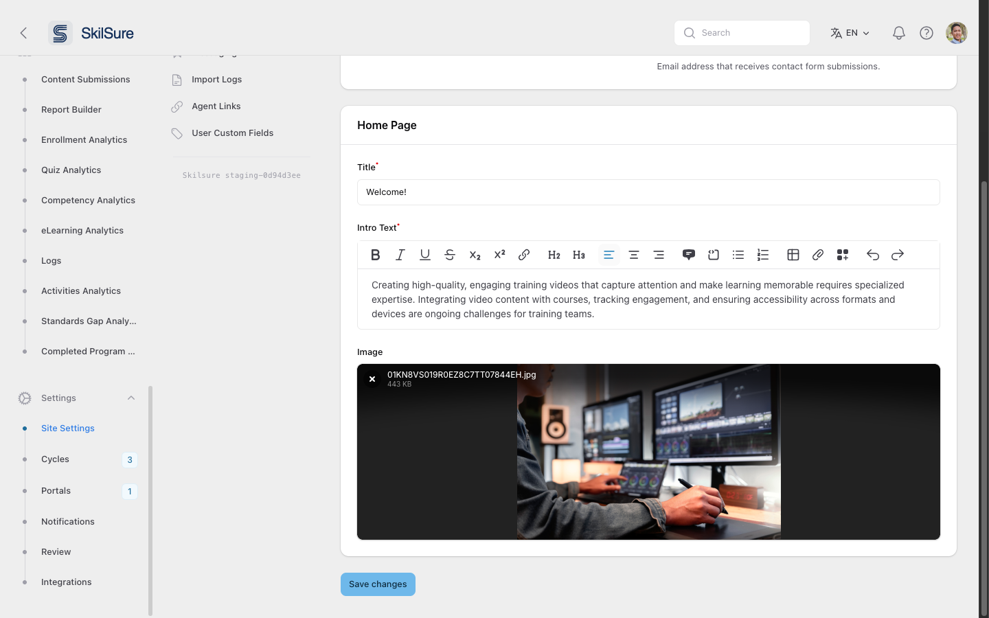 Home Page editor. The image becomes the hero on the user home; the title and intro text sit alongside it.
- Title — the heading users see (e.g. Welcome!). Required.
- Intro Text — a rich-text block under the title. Supports basic formatting, links, lists, tables, and embedded images.
- Image — the hero image displayed next to the welcome copy. Use a wide landscape image for the best fit.
User View Footer
An optional footer shown at the bottom of every page users see in this portal — useful for support contacts, office hours, or a regulatory notice you want always in reach.
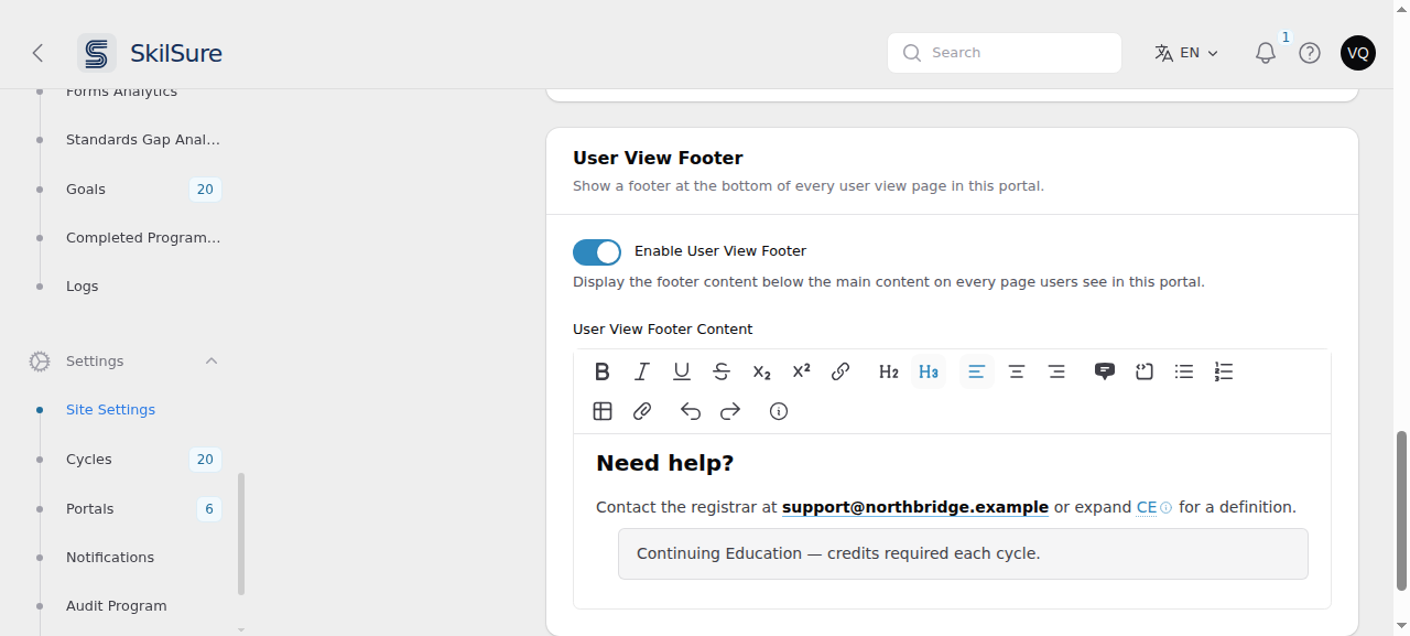 User View Footer. The content editor only appears once Enable User View Footer is on.
- Enable User View Footer — off by default. Turn it on to show the footer to users in this portal.
- User View Footer Content — appears only while the toggle is on. A rich-text editor with the full toolbar: formatting, headings, alignment, lists, tables, links, images, and collapsible definitions.
You write the footer in your own language, the same way the Intro Text field works. Users see the version matching their own language preference, falling back to English if you haven't written theirs yet.
Turning the footer off keeps your content
Switching Enable User View Footer back off hides the footer but does not erase what you wrote. Turn it on again and your content is still there.
Sizing images — set the width, not the height
Images you add to the footer sit side by side on one line, so a row of app-store badges or partner logos works as you would expect.
When you resize one, set its width. A height set on its own is currently ignored and the image renders at its full original size, which can be far larger than you intended.
Sizing two logos to match takes one extra check: scale them by the size of the visible artwork, not the size of the image file. Some supplied images — the official Google Play badge is one — carry a wide transparent or blank margin baked in, so an image that is nominally the same height can look noticeably smaller on the page. If two logos look mismatched at the same height, that margin is usually why; crop it off before uploading, then size the cropped image.
An empty footer shows nothing
If the editor is effectively blank — you cleared it, or it only holds an empty paragraph — no footer is rendered at all, so users never see an empty bar. An image on its own does count as content.
Click Save changes at the bottom of the page to publish your edits. Changes are visible to users immediately on their next page load.
Other Site Settings sub-pages
The left sub-nav on Site Settings groups related configuration:
- General — tenant-wide basics.
- Appearance — colours, logos, and theme.
- Portal Settings — this page.
- User Profiles — fields and visibility rules on user profiles.
- Announcements — broadcast messages shown on the user home.
- Data Imports — configure recurring CSV/SFTP import sources.
- Messaging — internal messaging defaults.
- Import Logs — outcomes of past data imports.
- Agent Links — third-party integrations exposed in the user portal.
- User Custom Fields — additional structured fields collected from users.